12 Bathroom Color Palettes Designers Love
There’s something extraordinary about stepping into a bathroom that instantly makes you feel calmer, fresher, or even a little more glamorous. Unlike other rooms, bathrooms are deeply tied to ritual and renewal—where you start your day with energy and wind down at night with serenity. Color is the foundation of that experience. It doesn’t just decorate the space; it influences your mood, your perception of cleanliness, and even how big or small the bathroom feels.
Designers consistently emphasize the power of a well-chosen palette to turn a bathroom from basic to breathtaking. Whether you’re dreaming of a spa sanctuary, a chic boutique-hotel vibe, or a bold, fashion-forward look, these 12 color schemes are designer favorites for a reason. Each one tells a story, creates an atmosphere, and sets the tone for your daily rituals.
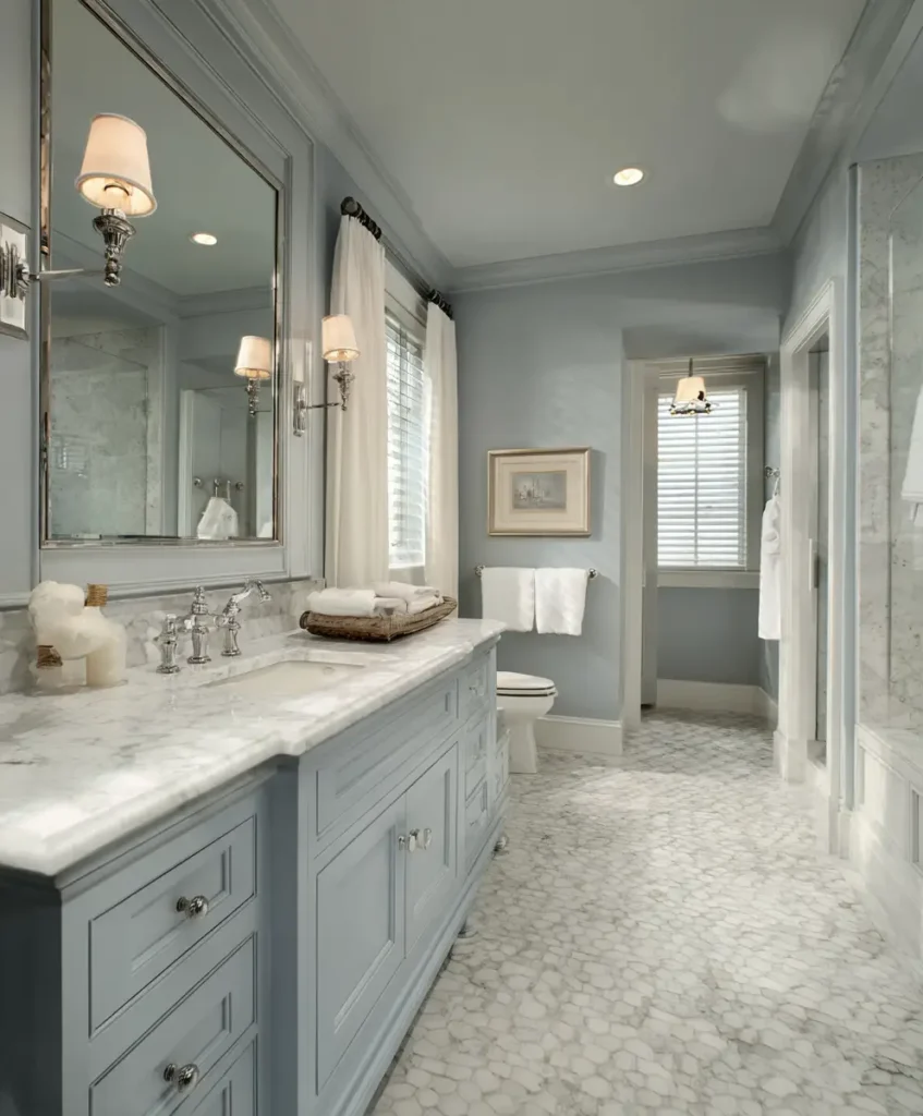
1. Crisp White and Soft Gray
A timeless combination, white and gray is the epitome of sophistication. White symbolizes purity and freshness, while gray grounds the palette with quiet elegance. Together, they create a bathroom that feels polished yet approachable, clean yet cozy. This duo is especially loved in modern interior design because it adapts effortlessly to both minimalist and traditional spaces.
Pro Tip: Use light gray for larger surfaces like walls or floors, then layer bright white on fixtures and trim for contrast.
Example: A white marble vanity with delicate gray veining adds luxury without overwhelming the space.
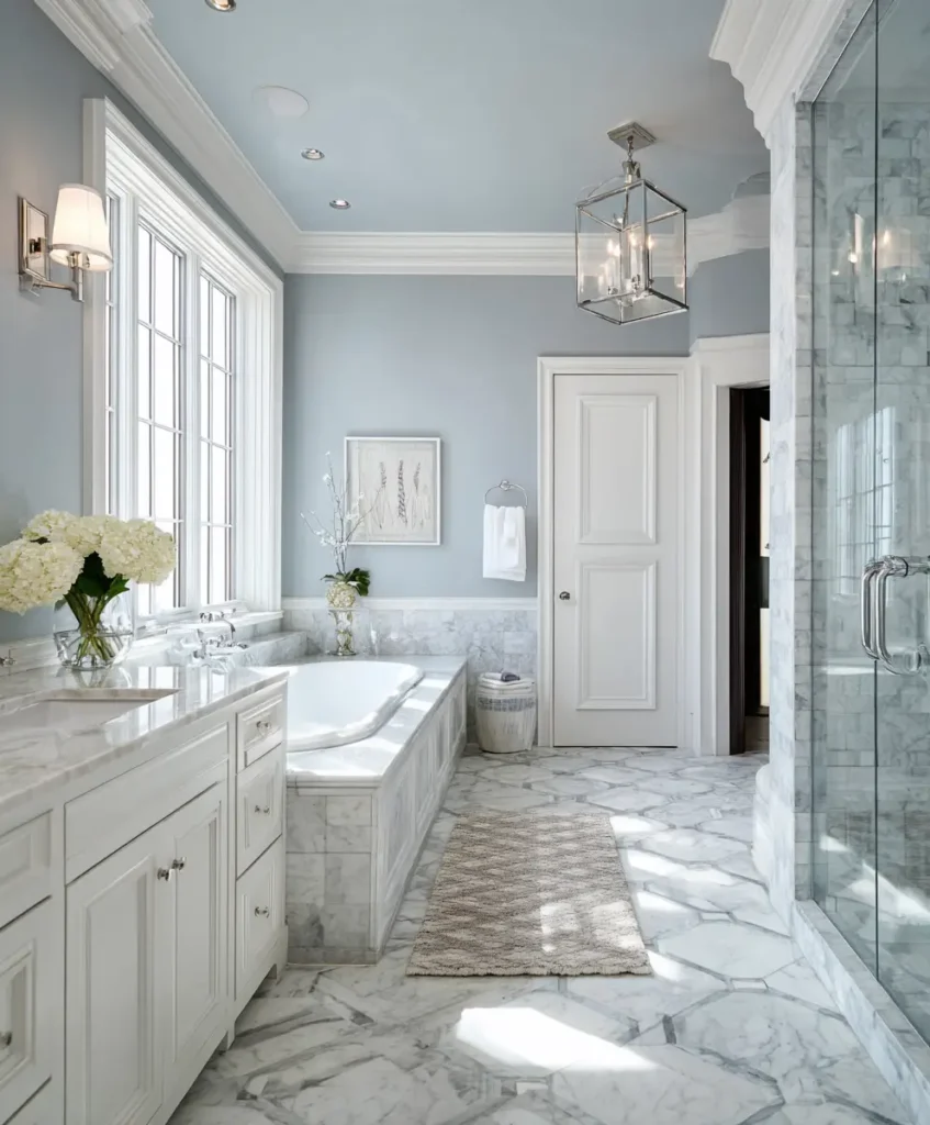
2. Spa-Inspired Blue and White
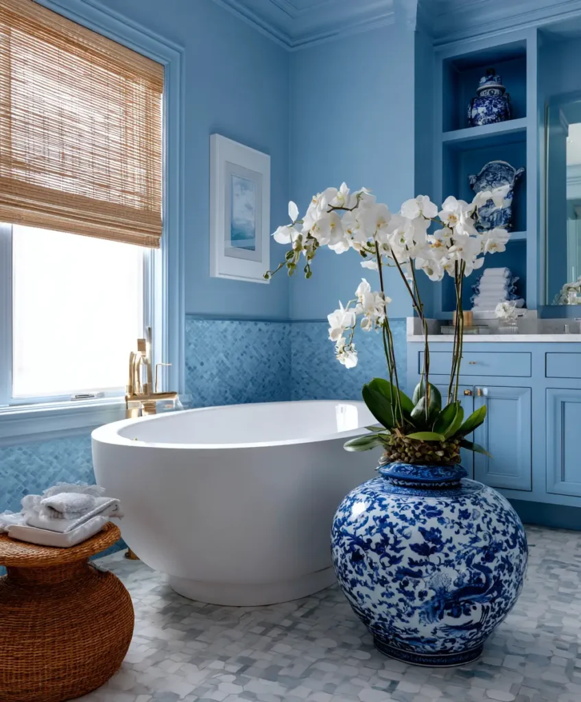
Blue is psychologically linked to calmness and clarity—it reminds us of the ocean, the sky, and open spaces. When paired with crisp white, the effect is both refreshing and restorative, which explains why this palette is a spa favorite. This pairing works especially well in small bathrooms, where blue’s cool undertone makes the room feel larger.
Pro Tip: Opt for watery shades like aqua or powder blue instead of darker navies if you want a lighter, spa-like feel.
Example: A powder blue vanity topped with glossy white quartz countertops creates instant tranquility.
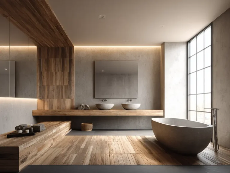
3. Earthy Beige and Warm Taupe
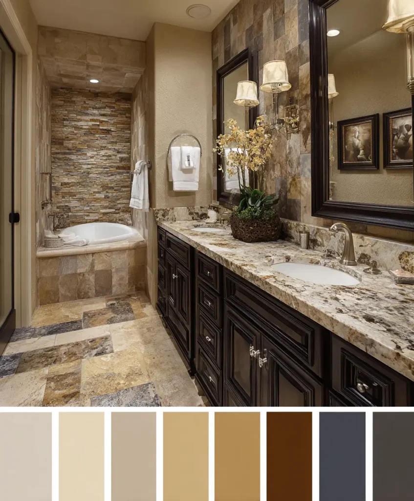
If you crave a bathroom that feels like a natural retreat, earthy tones are a safe bet. Beige and taupe echo stone, sand, and clay—materials that naturally put us at ease. Designers recommend this palette because it creates warmth without overpowering the space, making it versatile for both contemporary and rustic homes.
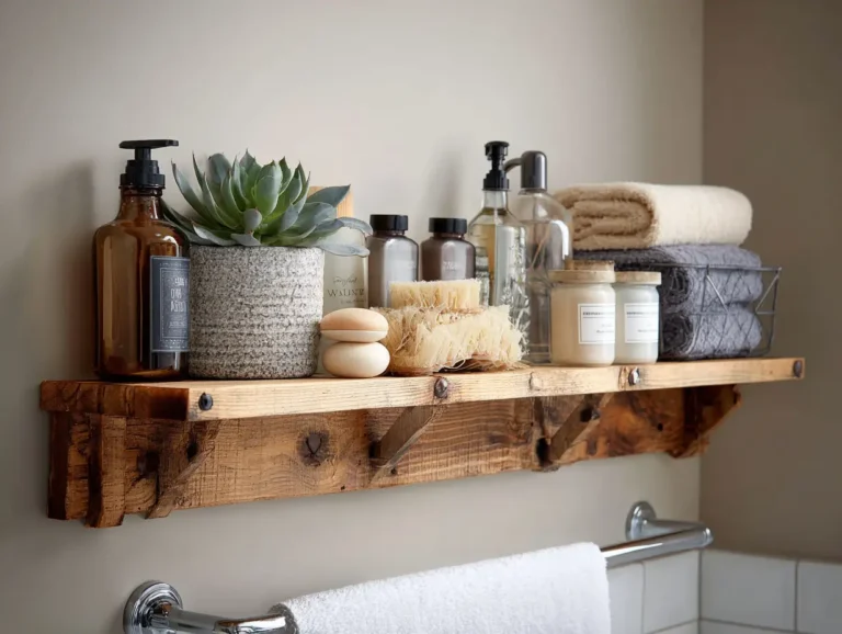
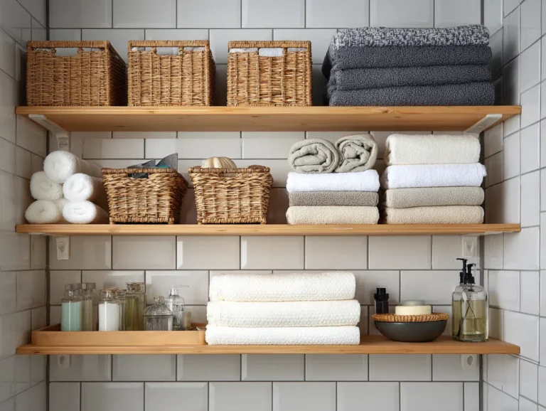
Pro Tip: Pair warm neutrals with natural textures such as stone sinks, wood shelving, or woven baskets for depth.
Example: Taupe stone tiles in a walk-in shower combined with a beige vanity make the space feel like a calming spa carved into nature.
4. Dramatic Black and White
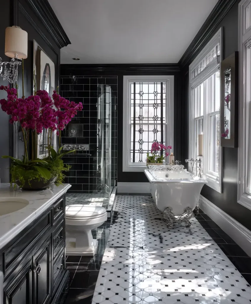
Black and white together create visual drama while remaining timeless. The stark contrast gives bathrooms a gallery-like quality, where every fixture and texture stands out. Psychologically, black signals luxury and authority, while white provides balance, keeping the look bold but never overwhelming.
Pro Tip: Introduce texture—think patterned floor tiles or paneled walls—so the palette feels layered, not flat.
Example: Black hexagon floor tiles with crisp white subway tile walls transform a bathroom into a show-stopping design statement.
5. Serene Green and Cream
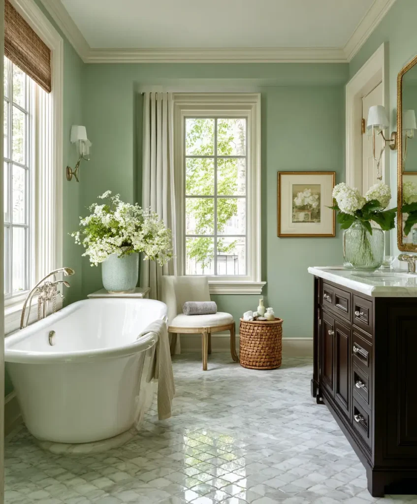
Green is deeply connected to nature, symbolizing renewal and balance. Paired with cream, it softens into a palette that feels restorative and gentle. Designers favor sage, eucalyptus, and mossy greens in bathrooms because they instantly evoke a spa-like atmosphere while staying sophisticated.
Pro Tip: Accent the green-and-cream palette with brushed gold or matte black hardware to give it modern depth.
Example: A freestanding tub backed by a sage green accent wall and creamy floor tiles creates the ultimate relaxation zone.
6. Blush Pink and White
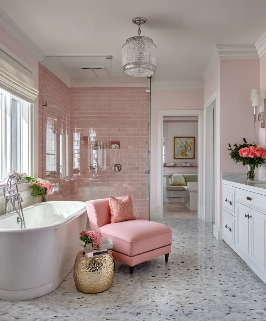
Blush pink adds warmth, softness, and personality to a bathroom, creating a welcoming atmosphere. When balanced with white, it feels modern and chic instead of overly sweet. Designers often recommend blush as an accent color because it’s subtle enough to remain timeless while adding personality.
Pro Tip: Introduce blush through tile, paint, or accessories like towels—it’s a low-risk way to bring in a playful yet elegant vibe.
Example: A blush pink vanity with gold hardware and white walls feels sophisticated and fresh.
7. Navy Blue and Brass
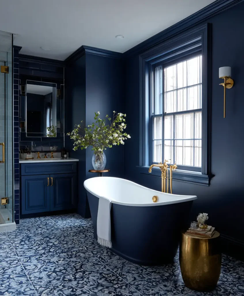
Navy carries depth and drama while still feeling classic. Designers love how it contrasts beautifully with brass fixtures, instantly creating a luxurious, hotel-like quality. Navy also has a grounding psychological effect, offering calmness without the cool detachment of lighter blues.
Pro Tip: Use navy on cabinetry or a single accent wall so the space feels bold but not closed in.
Example: A navy vanity with brass handles and a matching mirror frame instantly elevates the bathroom into a designer-worthy space.
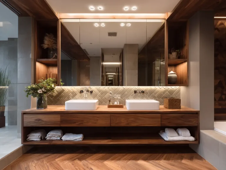
8. Charcoal and Natural Wood
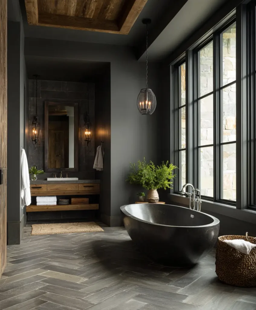
For those drawn to moody interiors, charcoal offers sophistication without the starkness of pure black. When paired with the warmth of natural wood, the palette achieves perfect balance—modern but inviting. Designers often use this scheme in contemporary homes that need both edge and comfort.
Pro Tip: Consider floating wood vanities or open shelving to soften the strong look of charcoal tiles or paint.
Example: A charcoal tiled shower with a teak bench brings the richness of a high-end spa into your home.
9. Soft Lavender and White
Lavender isn’t the first color most homeowners consider, but designers adore it for its calming, unexpected elegance. Associated with relaxation and wellness, lavender adds personality while remaining soft and understated. Paired with white, it feels fresh, airy, and modern.
Pro Tip: Use lavender in accents such as cabinets, textiles, or artwork rather than wall-to-wall coverage.
Example: White subway tiles with a lavender vanity create a subtle yet striking designer touch.
10. Warm Terracotta and Cream
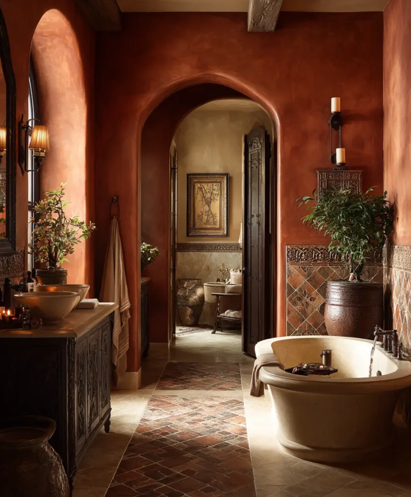
Terracotta brings in warmth, vibrancy, and Mediterranean charm. Its earthy undertones make it feel grounded and cozy, especially when softened with cream. Designers love terracotta because it adds character and depth, instantly making bathrooms feel unique.
Pro Tip: Use terracotta for flooring or accent tiles while keeping walls and ceilings light to prevent the space from feeling heavy.
Example: Cream walls with terracotta hexagon floor tiles transform a bathroom into a sun-soaked retreat.
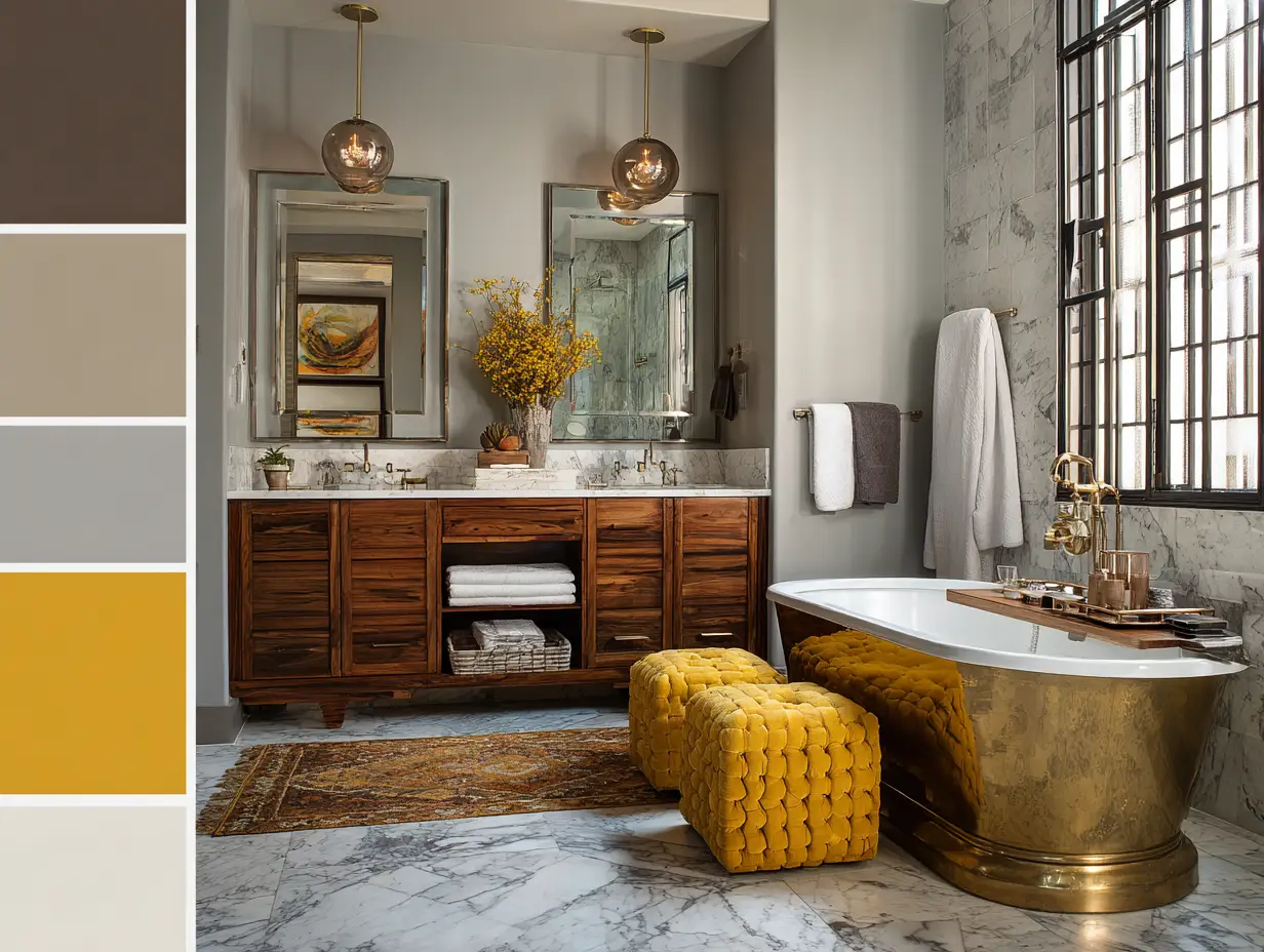
11. Monochrome Neutrals
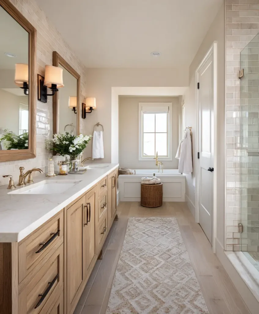
A layered neutral palette is ideal if you crave a spa-like escape. By mixing whites, creams, and soft grays, you achieve depth without relying on strong colors. This palette is all about texture, subtle tone shifts, and finishes rather than contrast.
Pro Tip: Combine matte and glossy surfaces to add interest—for example, glossy tiles with matte stone countertops.
Example: A beige vanity, white quartz countertops, and gray-veined marble flooring create a calm, seamless environment.
12. Soft Teal and Sand
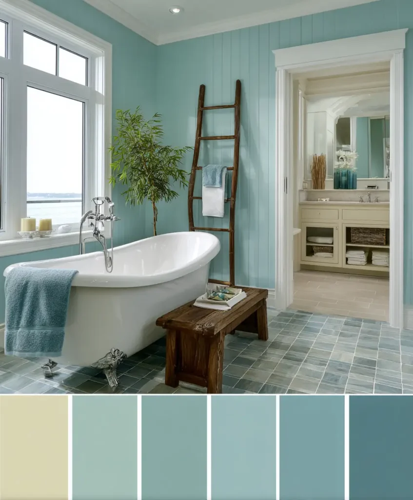
Teal brings the energy of the ocean, while sandy tones balance it with warmth. Together, they create a fresh, coastal-inspired palette that feels both soothing and stylish. Designers recommend this scheme for bathrooms where you want a breezy, uplifting feel without going full nautical.
Pro Tip: Keep décor minimal—white towels, rattan baskets, or woven rugs complement without overwhelming.
Example: A teal tiled shower paired with sand-colored walls transports you to a seaside spa retreat.
Final Thoughts
Bathrooms are more than utilitarian spaces—they’re where your day begins and ends, and color is the secret to setting the mood. From grounding taupes and terracottas to calming greens and spa-inspired blues, these designer-approved palettes prove that the right hues can transform your bathroom into a personal retreat.