15 Color Combinations That Make Kitchens Feel Bigger
The kitchen is more than just a place to cook—it’s a gathering spot, a creative hub, and often the heart of a home. Yet, if your kitchen feels cramped or dark, it can affect how welcoming it feels. While knocking down walls or investing in a full remodel isn’t always realistic, one powerful design strategy is often overlooked: color. The right palette can completely transform how spacious your kitchen appears, making it brighter, taller, and more open.
Color psychology shows that lighter shades tend to recede, making walls feel farther away, while darker shades bring coziness and depth when used thoughtfully. When combined strategically, these colors trick the eye into seeing more space than there actually is. Below, we’ll explore 15 tried-and-true color pairings that expand kitchens visually, backed by design principles and real-life applications.
1. White and Soft Gray
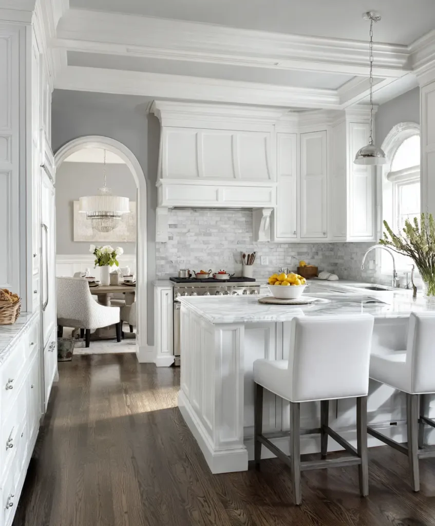
Nothing says fresh and expansive like a white and soft gray pairing. White maximizes brightness by bouncing natural light around the room, while gray brings subtle depth so the design doesn’t fall flat. This combination works especially well in modern kitchens where clean lines dominate, but you still want a touch of warmth.
Pro Tip: Use a lighter gray on lower cabinets to ground the space and pure white on walls and upper cabinetry. This draws the eye upward, making ceilings feel taller and the whole room appear larger.
Example: Think of a kitchen with white subway tiles, light gray shaker cabinets, and stainless steel hardware. The result is sleek, timeless, and airy.
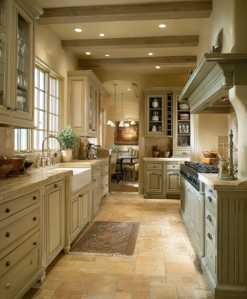
2. Cream and Warm Taupe
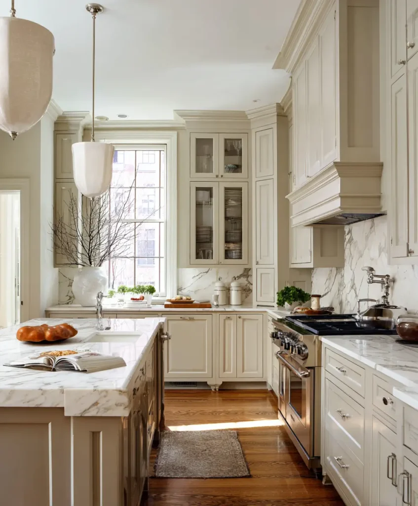
If bright white feels too stark, cream paired with taupe is a softer, more inviting alternative. Cream reflects light without being harsh, while taupe adds sophistication and balance. Together, they make a kitchen feel cozy yet open, a sweet spot between minimalism and warmth.
Pro Tip: Pair cream cabinetry with a taupe backsplash or accent wall. To elevate the look, add brushed brass handles or lighting fixtures for a sophisticated touch that still feels approachable.
3. Pale Blue and White
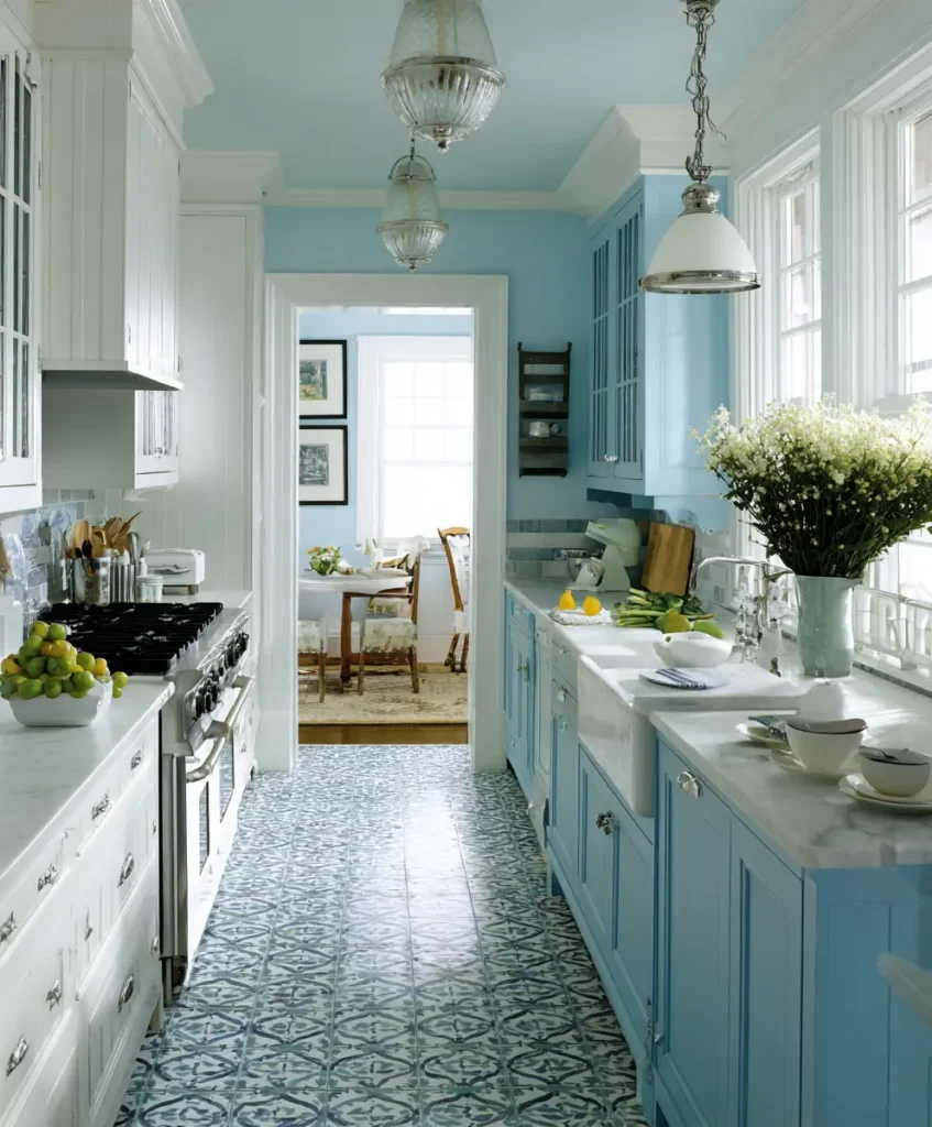
This combination feels fresh, calming, and expansive, drawing inspiration from coastal interiors. Pale blue brings a sense of serenity, while white maintains a clean, open canvas. In smaller kitchens, this palette mimics the lightness of sky and sea, creating a refreshing atmosphere.
Pro Tip: Use pale blue for base cabinets and white for walls and upper cabinets. The light bounces off the white, while the soft blue anchors the space without closing it in.
Example: Picture a charming cottage kitchen with white beadboard walls and sky-blue cabinetry—the whole space feels breezy and uncluttered.
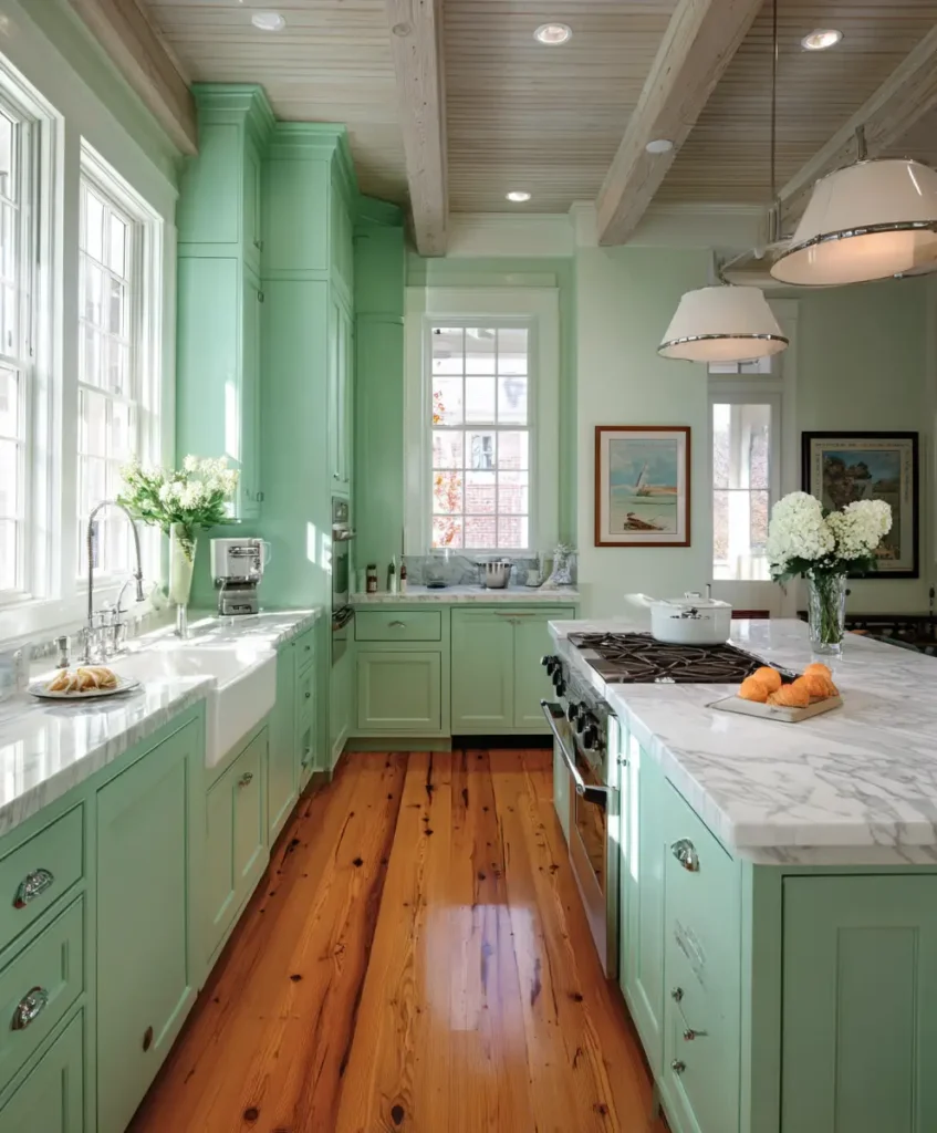
4. Soft Sage and Off-White
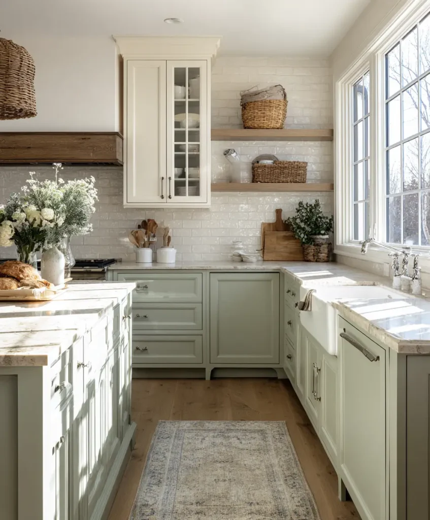
Sage green is a favorite in modern home decor because it’s muted, calming, and versatile. Paired with off-white, it brings a natural, organic feel to the kitchen. The connection to greenery and nature makes even the smallest kitchen feel more expansive and inviting.
Pro Tip: Combine sage cabinetry with off-white walls, natural wood shelves, and simple black hardware for a look that’s timeless yet fresh.
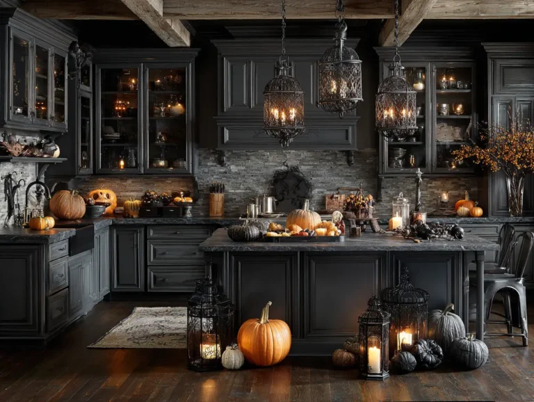
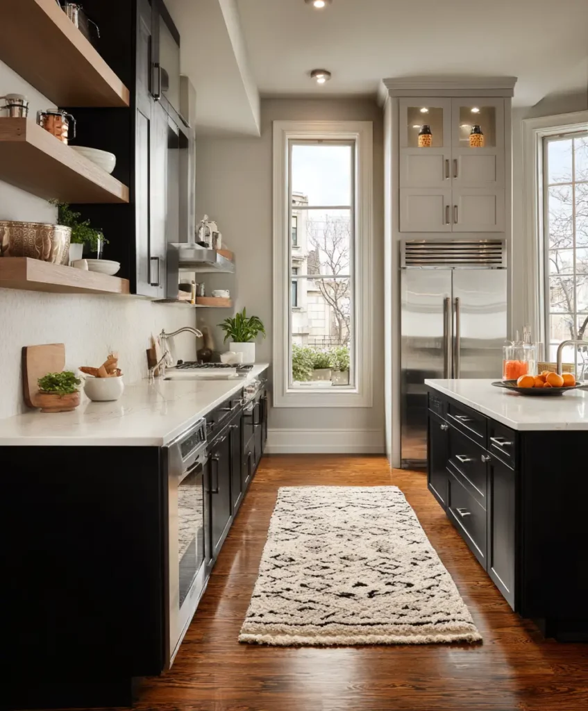
5. Charcoal and White
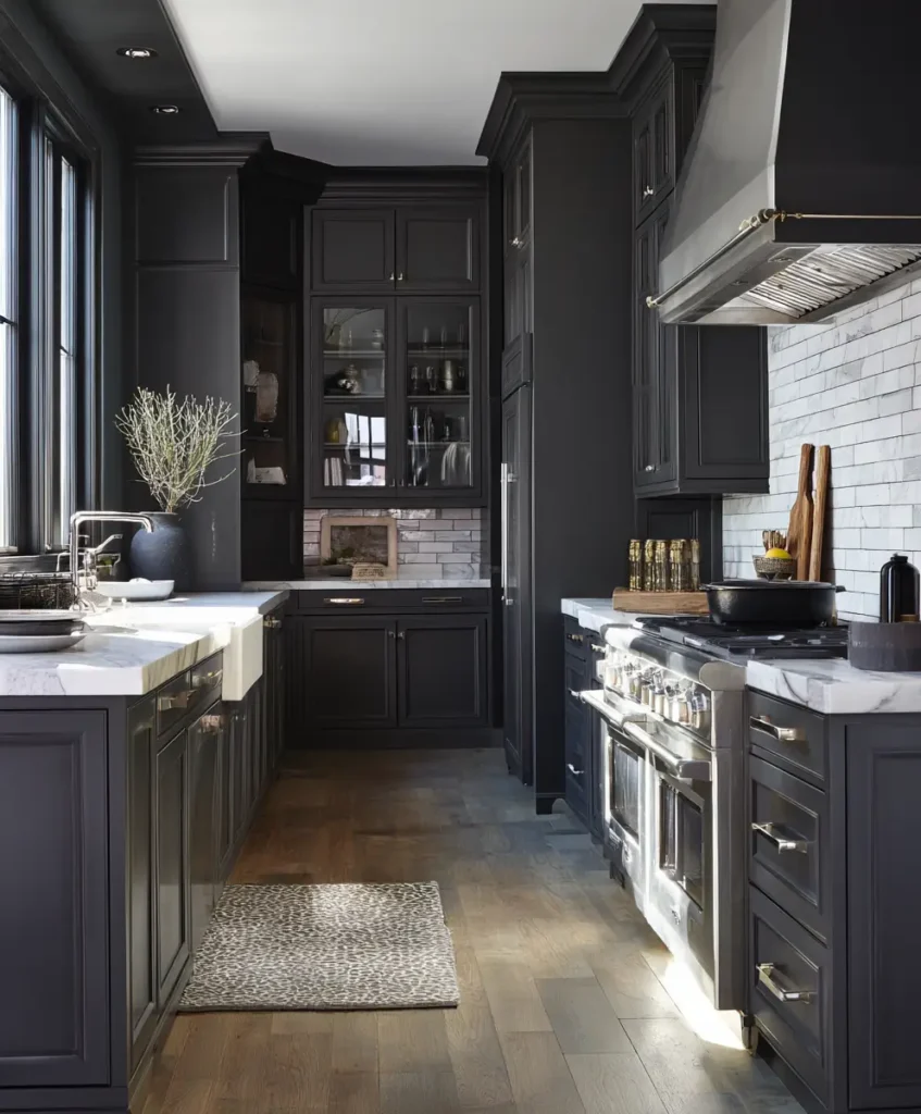
For those who love bold design, charcoal and white provide the perfect balance of drama and brightness. The white prevents the charcoal from feeling heavy, while the dark shade creates striking depth that visually pushes the walls outward.
Pro Tip: Keep upper cabinets or walls white and use charcoal on lower cabinetry or an island. This creates contrast and sophistication while maintaining an open feel.
Example: A contemporary loft kitchen with a charcoal island, white walls, and black pendant lights looks both spacious and chic.
6. Soft Blush and Ivory
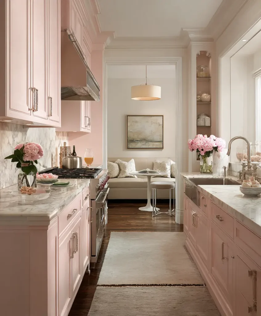
Blush pink is subtle, romantic, and surprisingly effective in kitchens. When paired with ivory, it creates a warm glow that reflects light beautifully without overpowering the room. The soft tones keep the kitchen feeling light and inviting.
Pro Tip: Try blush on backsplash tiles or a feature wall, balanced by ivory cabinetry. Add copper or rose-gold accents to enhance the palette without cluttering it.
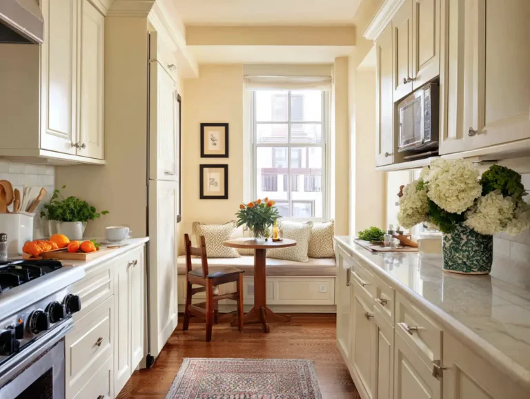
7. Light Wood and White
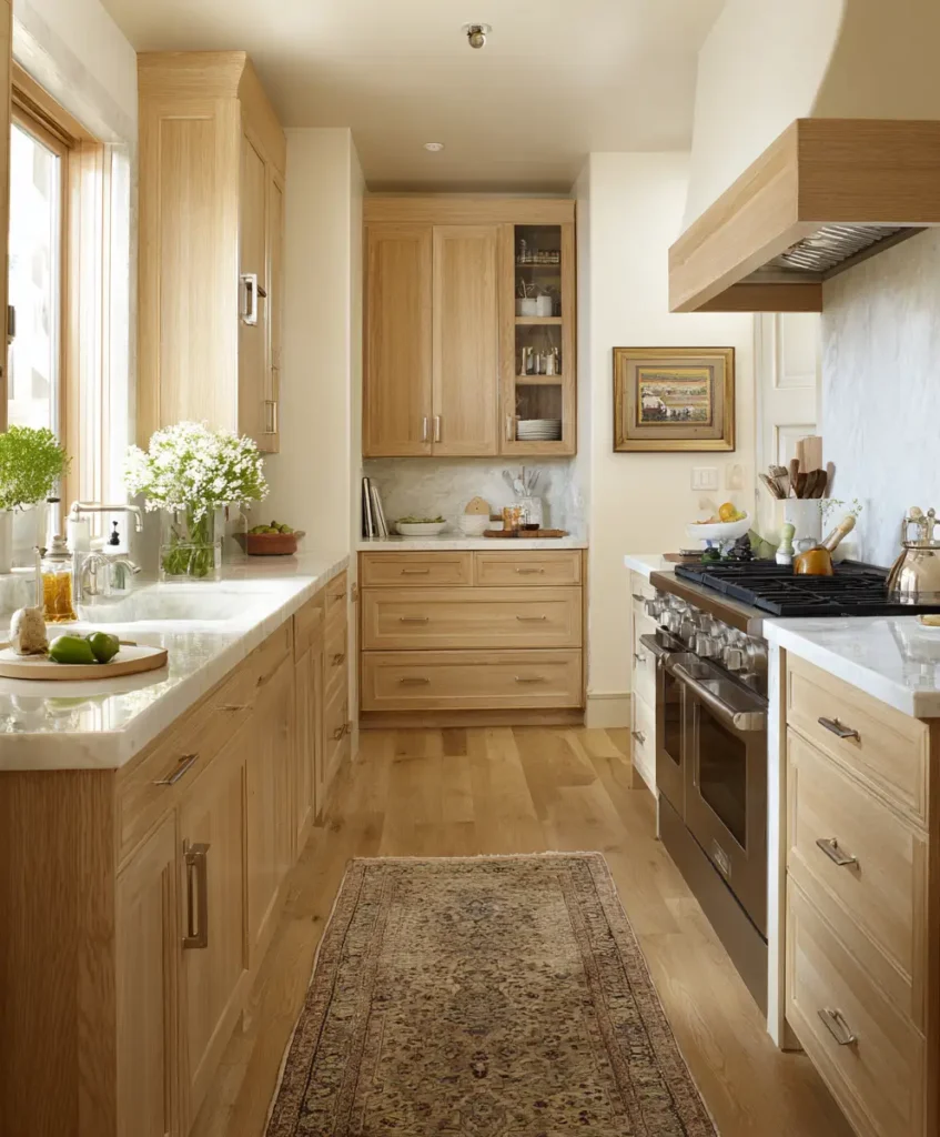
Scandinavian-inspired kitchens thrive on this pairing. Light wood brings in natural texture and warmth, while white amplifies brightness and visual space. Together, they create a balance of minimalism and coziness that feels expansive and inviting.
Pro Tip: Choose oak or ash wood cabinetry with white quartz countertops. Open shelving in light wood against a white wall further enhances the airy vibe.
8. Beige and Soft Green
This earthy pairing creates a sense of calm and connection to nature. Beige acts as a warm base color, while soft green adds freshness and contrast. This combination works well in small kitchens because it avoids harsh contrasts and instead layers gentle tones.
Pro Tip: Beige walls paired with sage or pastel green cabinetry, complemented by woven rattan stools or baskets, make the space feel grounded yet light.
9. Navy and White
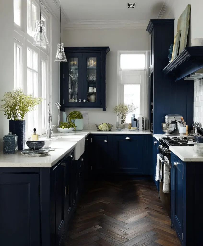
While navy is bold, pairing it with crisp white results in a classic and spacious look. White keeps the kitchen feeling airy, while navy provides elegance and depth. The contrast draws the eye, creating a sense of dimension that makes the space feel larger than it is.
Pro Tip: Use navy on an island or lower cabinetry, keeping walls and upper cabinets white to maintain brightness. Add gold or brass hardware for a refined finish.
10. Warm Gray and Pale Yellow
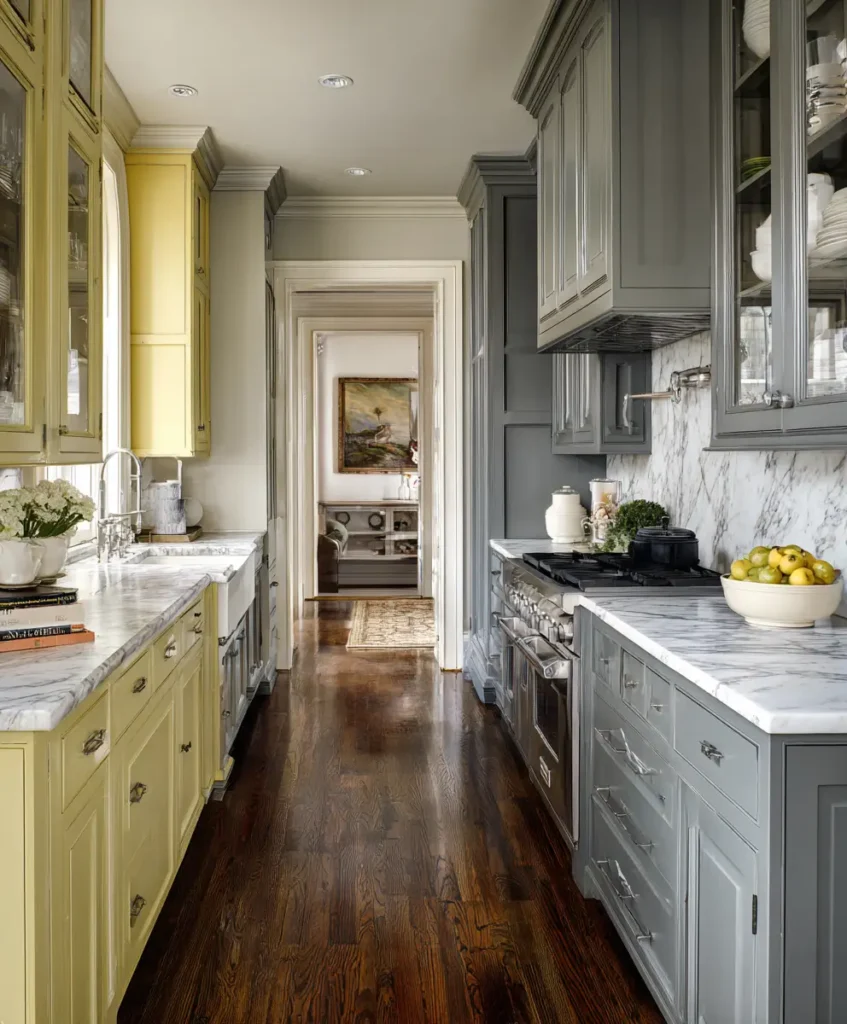
If you want to inject energy into a small kitchen without overwhelming it, warm gray and pale yellow are the perfect partners. Yellow reflects natural light, making the room feel cheerful and larger, while gray tones it down for balance.
Pro Tip: Use pale yellow on walls or backsplash tiles, combined with warm gray cabinetry. Add stainless steel appliances for a modern twist.
11. Terracotta and Cream
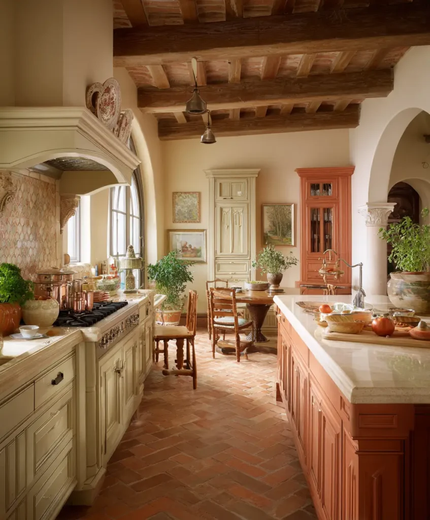
Terracotta is earthy, rich, and trending again in modern interiors. When paired with cream, it adds warmth without overwhelming the space. This color combination brings a Mediterranean-inspired vibe that feels open and sunlit.
Pro Tip: Introduce terracotta through backsplash tiles or decorative pottery, keeping most cabinetry and walls cream. The contrast adds warmth while maintaining brightness.
12. Mint Green and White
Mint green is playful, refreshing, and perfect for brightening compact kitchens. Its vibrancy is balanced by white, which ensures the space still feels light and uncluttered. This palette also works beautifully in retro or mid-century modern-inspired kitchens.
Pro Tip: Mint tiles for the backsplash paired with white cabinetry and chrome hardware create a retro yet modern effect.
13. Black and Light Gray
Contrary to what many think, black can actually make a kitchen look bigger when used sparingly and paired with lighter tones. Black creates depth, while light gray softens the contrast for an elegant yet spacious look.
Pro Tip: Use black only on accents—bar stools, hardware, or pendant lights—against a light gray backdrop. The gray keeps the room open while black adds dimension.
14. Warm White and Natural Stone
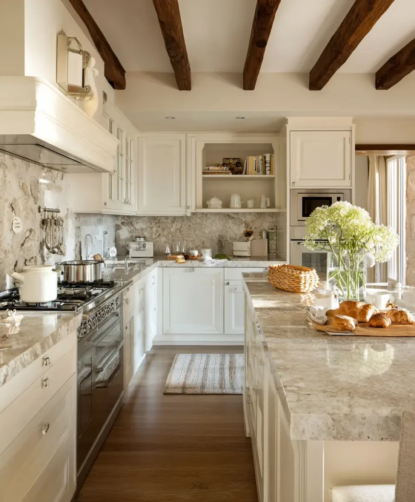
Natural stone with subtle veining—like marble, quartz, or granite—adds texture and dimension to a kitchen. Pairing it with warm white ensures the space stays bright and layered, giving the illusion of depth and openness.
Pro Tip: Choose countertops or backsplashes with delicate gray or beige veining. The subtle pattern reflects light while adding visual interest.
15. Soft Lavender and White
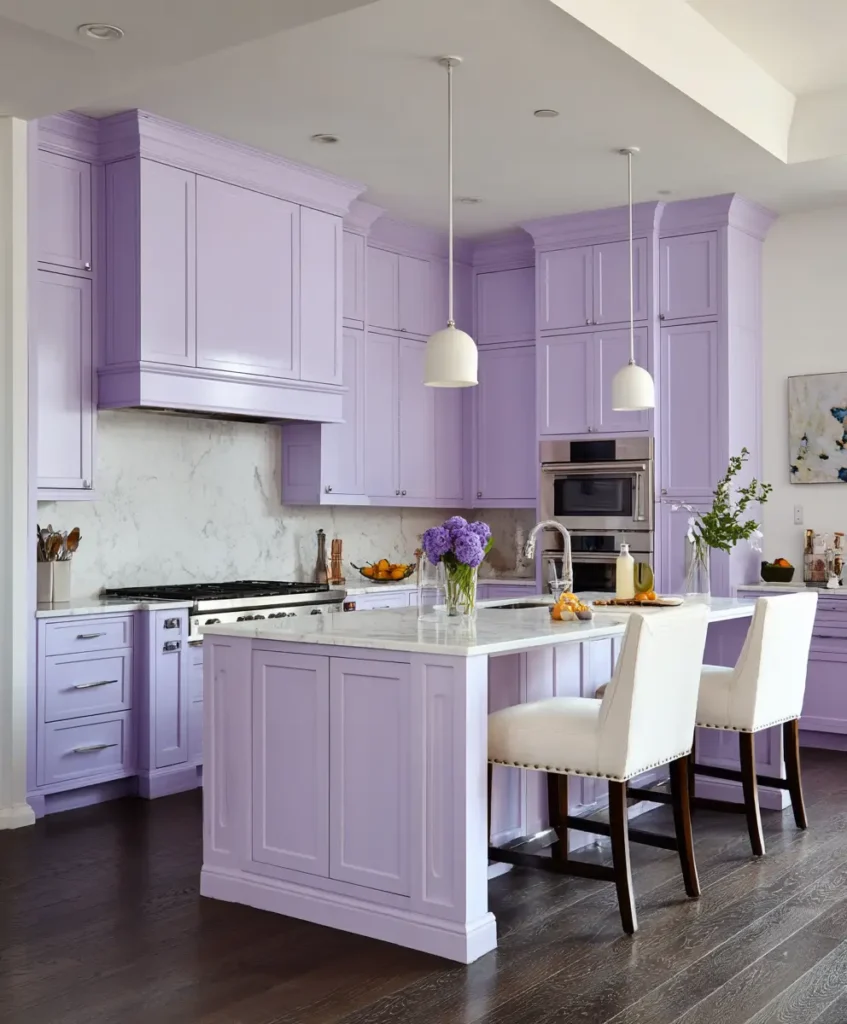
Lavender is an unexpected yet uplifting choice. When combined with white, it creates a calming, airy vibe. The cool undertone of lavender reflects light and makes walls appear farther away, tricking the eye into seeing more space.
Pro Tip: Use lavender on a feature wall or in small doses (like cabinetry accents), paired with crisp white to maintain a fresh look.
Final Thoughts
The beauty of these color combinations is that they don’t just make a kitchen appear larger—they make it feel more welcoming, functional, and stylish. Whether you lean toward classic neutrals like white and gray or prefer fresh, playful tones like mint or blush, the right pairing can redefine our space.